

HYDRATION TRACKING ECOSYSTEM
A smart bottle and companion app that makes staying hydrated automatic and rewarding. No logging, no reminders, no guilt.
role
Product Designer
year
2025 - 2026
Type
Retention · Gamification
TOOLS
Figma · Illustrator
01 | The Problem
Instead, you notice the headache you've been trying to ignore, the sudden drop in focus after lunch, and a low mood you can't explain. Health apps are often designed for physical milestones, but cognitive health is much more volatile.
Clinical data shows that a fluid loss of just 1.4% - easily reached during a sedentary morning at a desk - is enough to measurably degrade focus, mood and executive function. Thirst is a lagging indicator. By the time the signal kicks in, you've already experienced the symptoms.
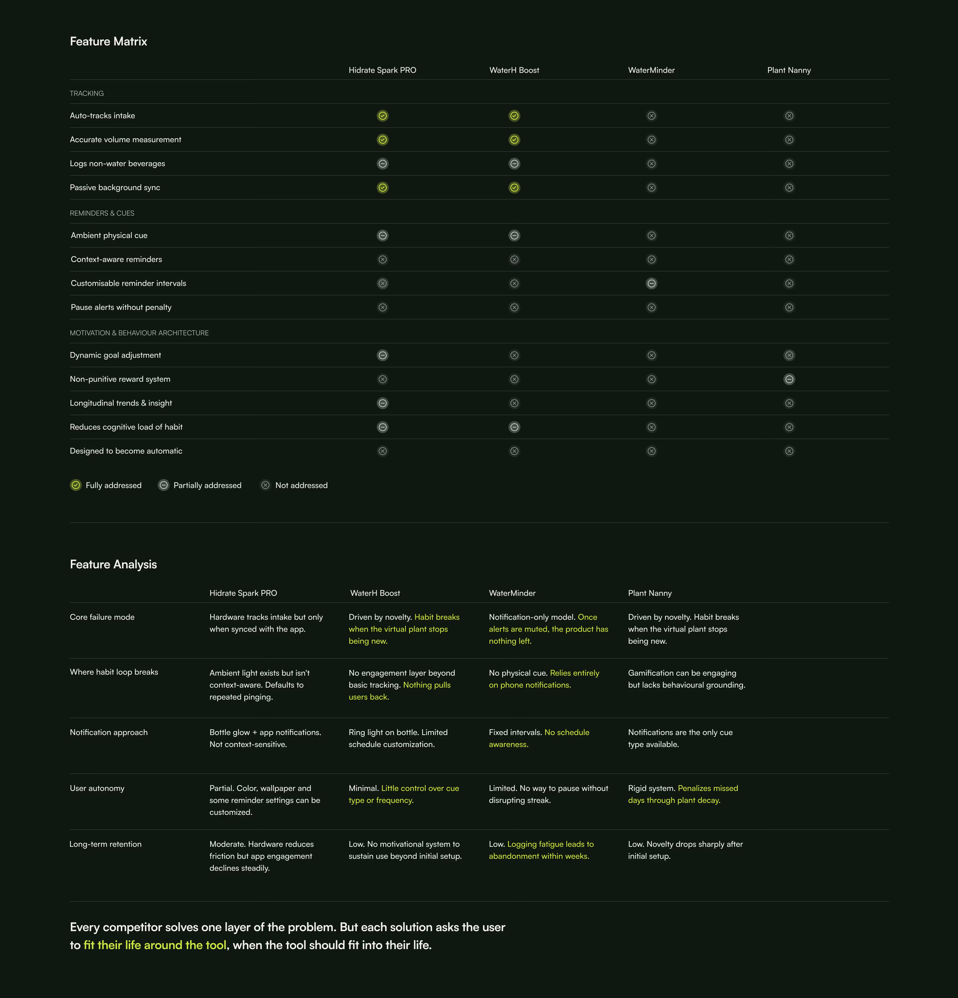
"Most health apps fail because they're trying to fix a memory problem that doesn't exist. People don't forget to drink water, they just skip it because the app makes it feel like extra work."
Armstrong et al., 2012
Body mass fluid loss measurably degrades focus and mood.
Primary research · n=15
Had tried a hydration app and abandoned it.
Primary research · n=15
Only noticed dehydration after symptoms appeared.
02 | Research
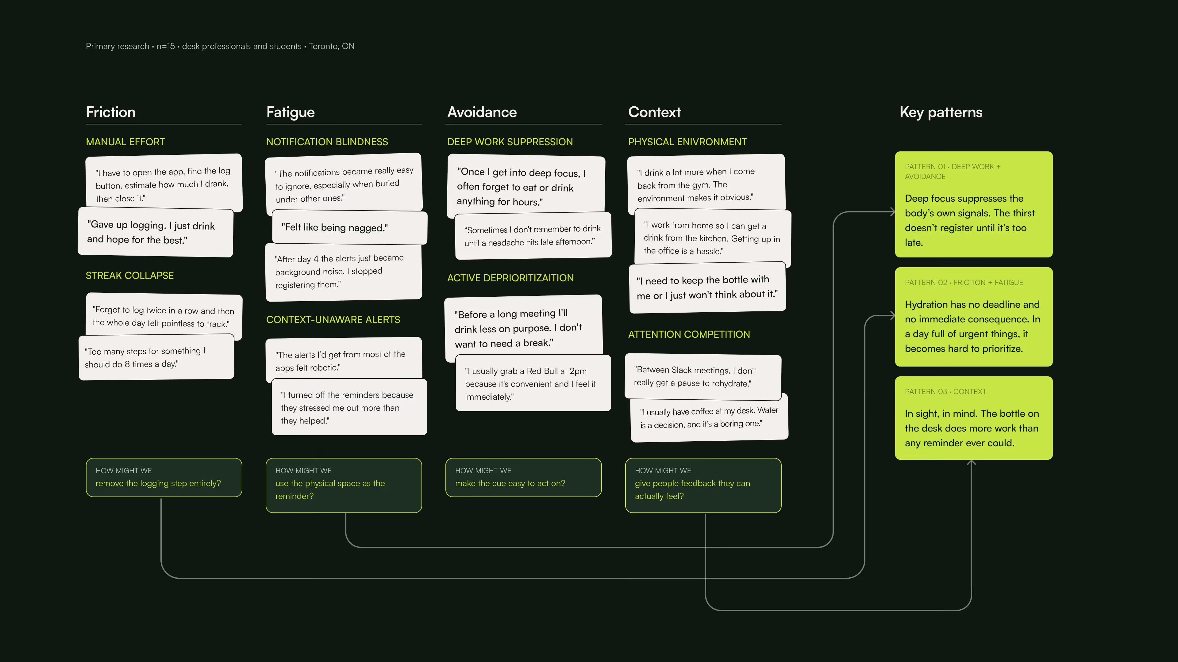
I interviewed 15 Toronto-based professionals and students. Their experiences with existing hydration tools were surprisingly consistent.
"Once I get locked into work, I'll forget to eat or drink anything for hours."
VIDEO EDITOR · Toronto
"Before a long meeting I'll drink less on purpose. I don't want to need a break."
Student · Toronto
"I need to keep the bottle with me or I just won't think about it."
Creative professional · Toronto
Participants weren't actually forgetting to drink water, they were actively deprioritizing it. When staying hydrated requires constant, conscious effort, it has to compete with everything else to grab our attention. Flooding users with more reminders only adds to the noise, causing them to tune them out completely.
The goal isn't better reminders, it's a system that makes reminders unnecessary.
03 | behaviour framework
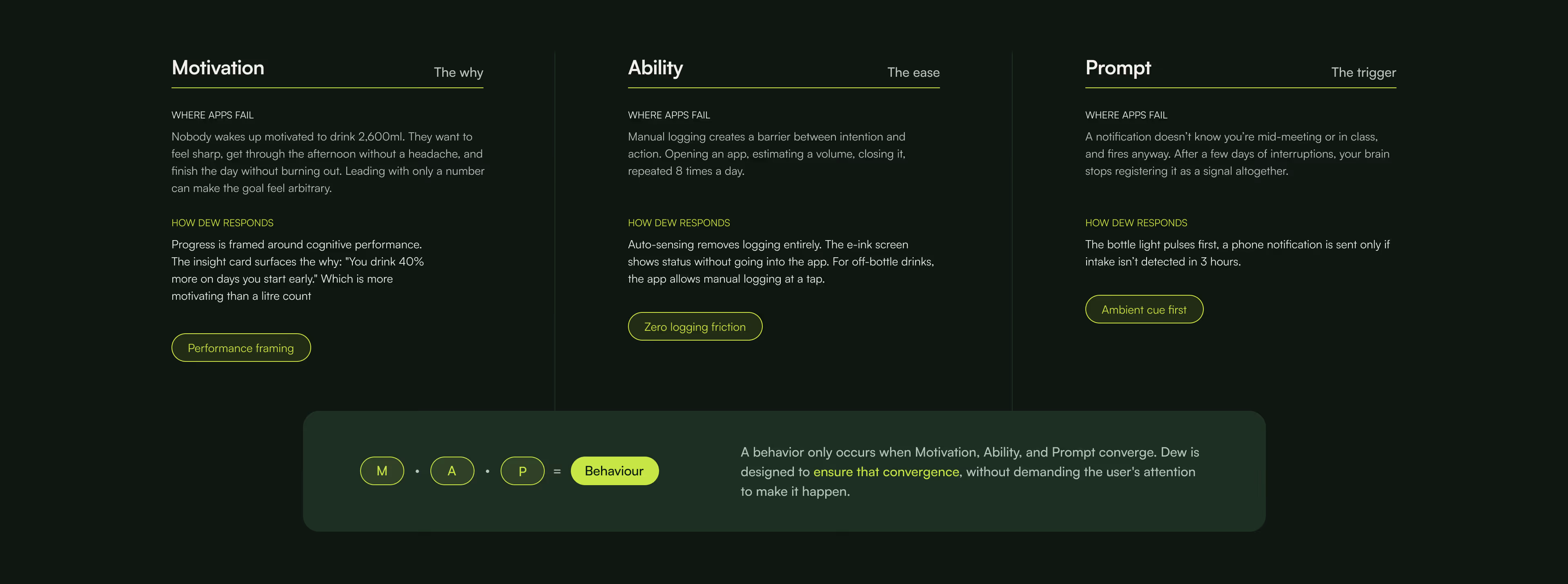
Building a behavioural system was tricky since we often mistake nagging for helping. In BJ Fogg's Behavior Model, behavior happens when motivation, ability and a prompt meet. Yet, many health apps rely entirely on spamming notifications, ignoring whether you actually have the capacity to act in that moment. These repeated interruptions can lead to notification fatigue.
I used Fogg's framework to reverse-engineer the experience: I lowered the barrier to entry by removing the tedious logging process, shifted the motivation from rigid compliance to personal performance, and traded repeating notifications for subtle real world cues.
"We often mistake nagging for helping."
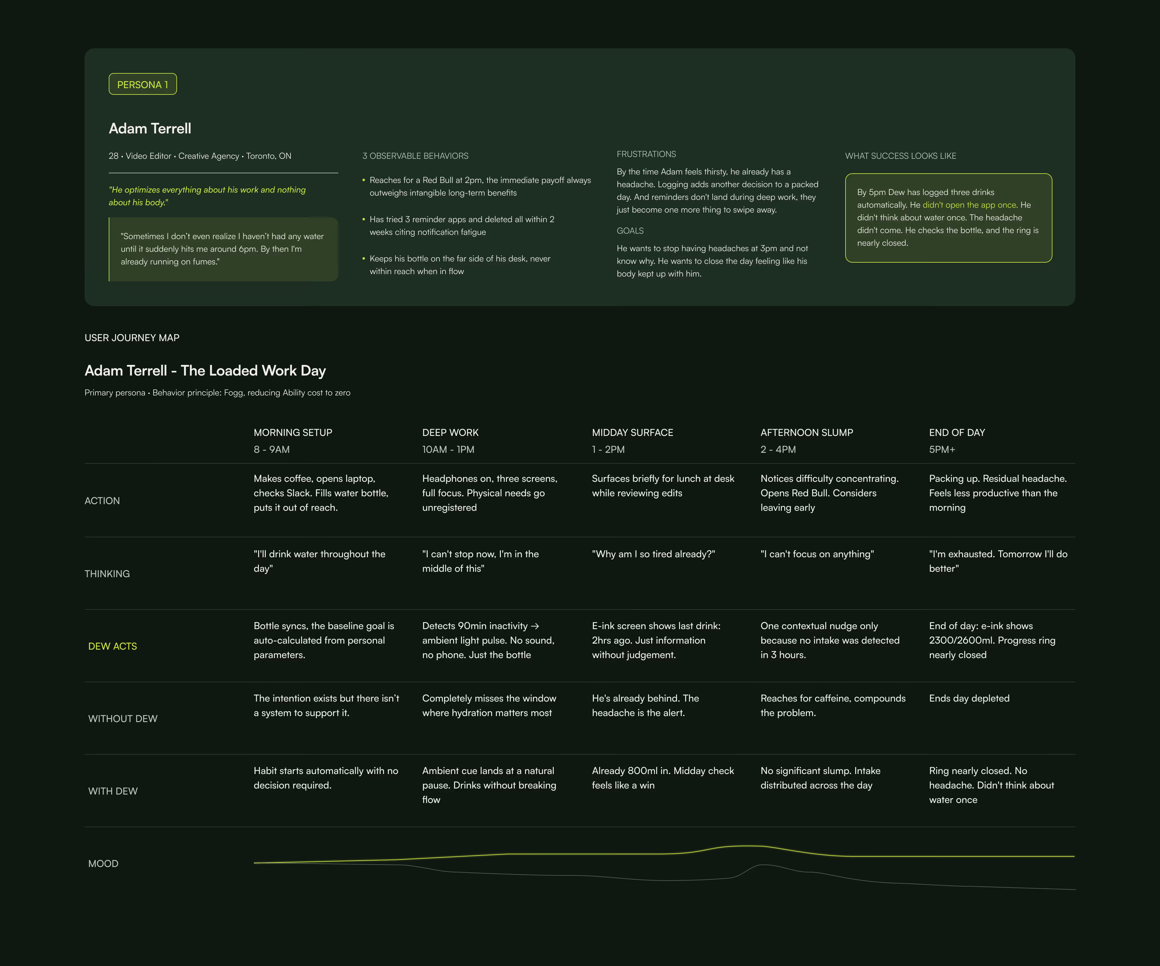
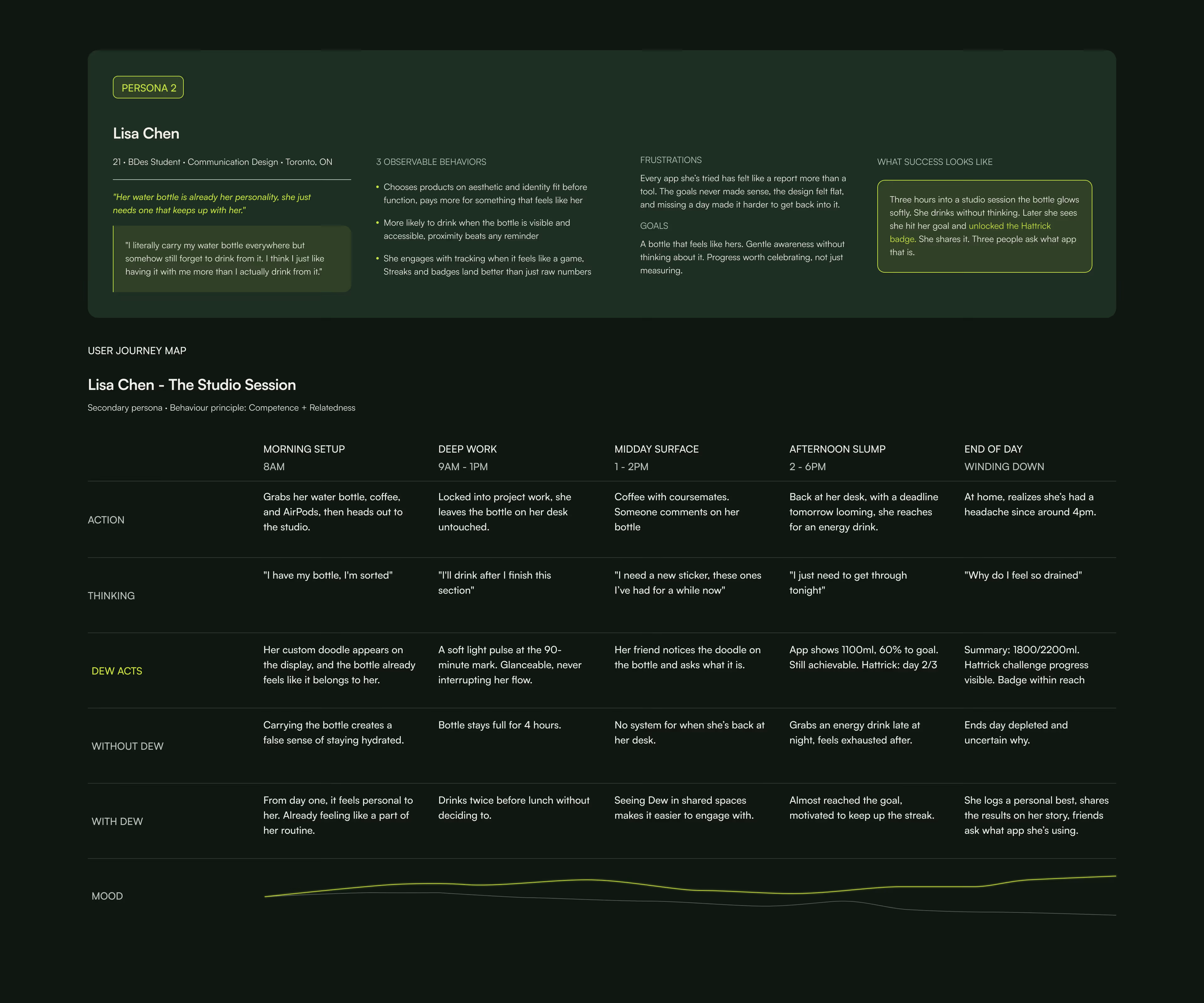
04 | who this is for
Adam is 28, a video editor at a creative agency. He spends long hours at his desk optimizing everything about his workflow, leaving little room to take care of himself. He's tried and deleted a few tracking apps because the logging adds another decision to a packed day. He just wants to stop feeling sluggish in the evening without knowing why.
Lisa is 21, a third-year Communication Design student who never goes anywhere without her water bottle. But to actually track her habits, she needs it to feel like a game. If it’s fun and designed well enough, she'll share her progress with her friends.
With Adam barely opening the app and Lisa being keen on maintaining her streak, dew had to design around two completely different behaviors. This constraint forced me to build a product that is just as effective passively as it is actively.
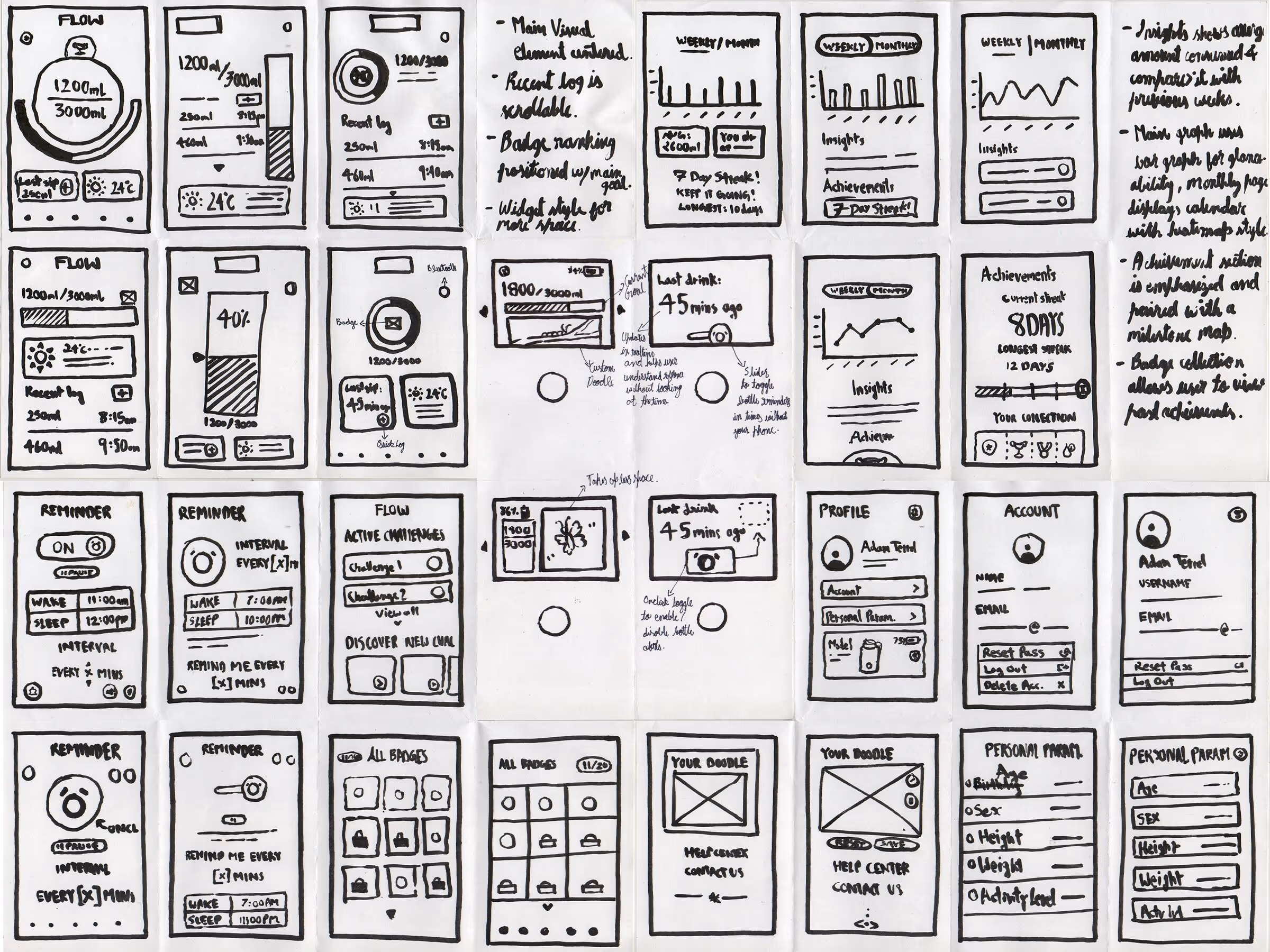
IDEATION & ROUGH SKETCHES
In the early stages of ideation, I worked across multiple layouts for both the app interface and the bottle e-ink screen, trying to reach a balance with presenting a reasonable amount of information while making it condensed. The progress ring emerged early and stayed throughout most stages - it helped with framing it as a daily loop rather than reaching an end point. The most iterated decision was the hierarchy between the insight cards, stat cards and the log board. The stat cards were shifted closer to the top to draw more attention and the insight cards below to give more context.
05 | Design Decisions
Passive sensing over manual logging
Every hydration app expects you to log your drinks. But opening an app and estimating the volume eight times a day can be a hassle. Each of those moments is a point where the habit falls apart. Logging fatigue adds up fast. Dew removes it from the equation entirely. With automatic tracking built into the bottle, you only touch the app when you actually want to.
Ambient bottle cue over push notification
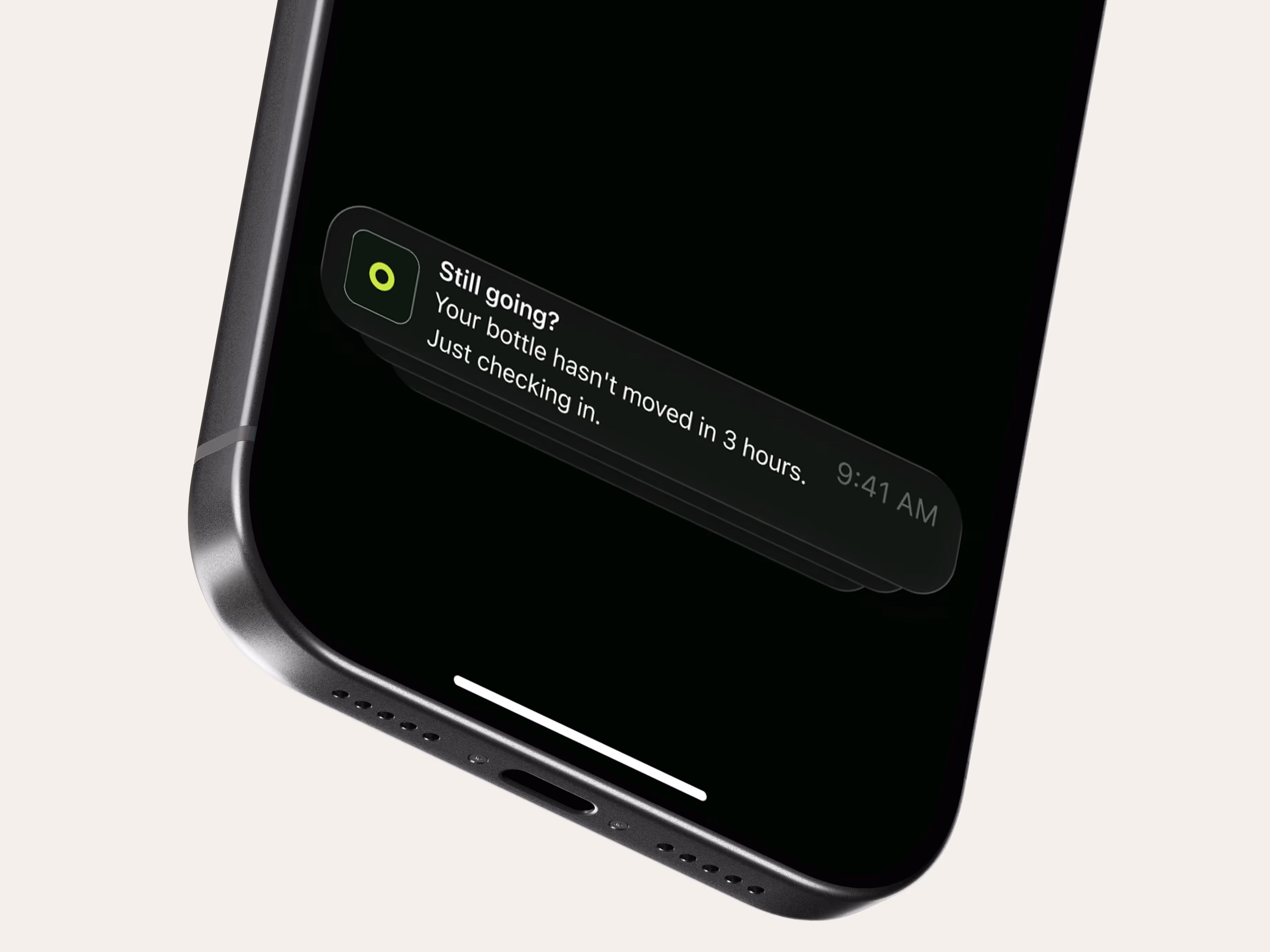
A notification doesn't care if you're in a meeting or writing a brief, it fires anyway. Eventually, after enough poorly timed interruptions, your brain just tunes them out entirely. Dew starts in the physical environment. The bottle light pulses ambiently, giving you a nudge without making you pick up your phone. You only get an actual phone notification if three hours pass with no detected intake, just one alert per session.
Achievements you unlock over streaks
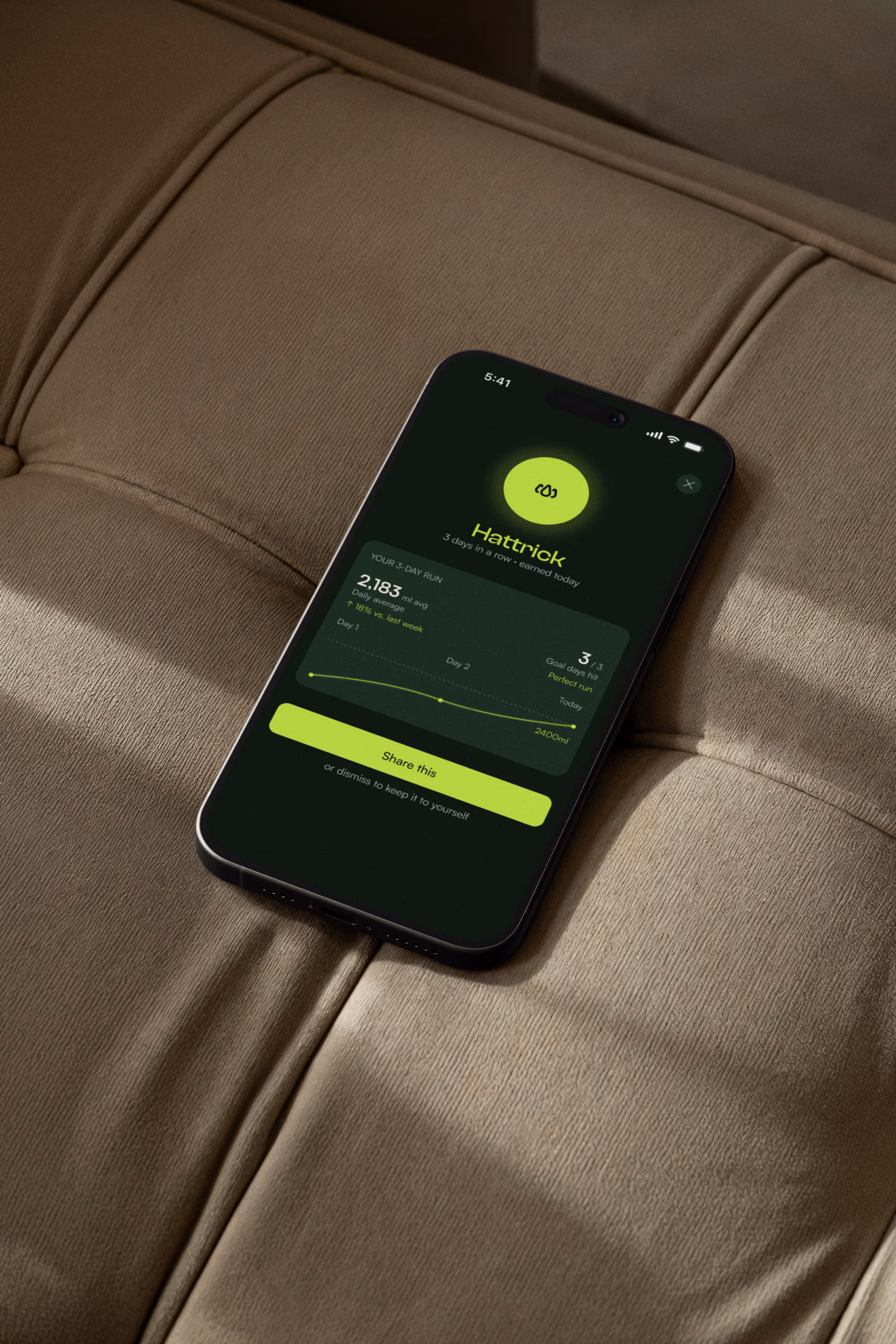
Streak systems can make you feel guilty for the days you missed, which is the exact opposite of what behavior change research supports. Dew’s challenges are milestones you unlock. Missing a day doesn't wipe out your progress; your badges will still be there the next day. It’s Self-Determination Theory in practice, building a sense of competence through progress that feels worth celebrating.
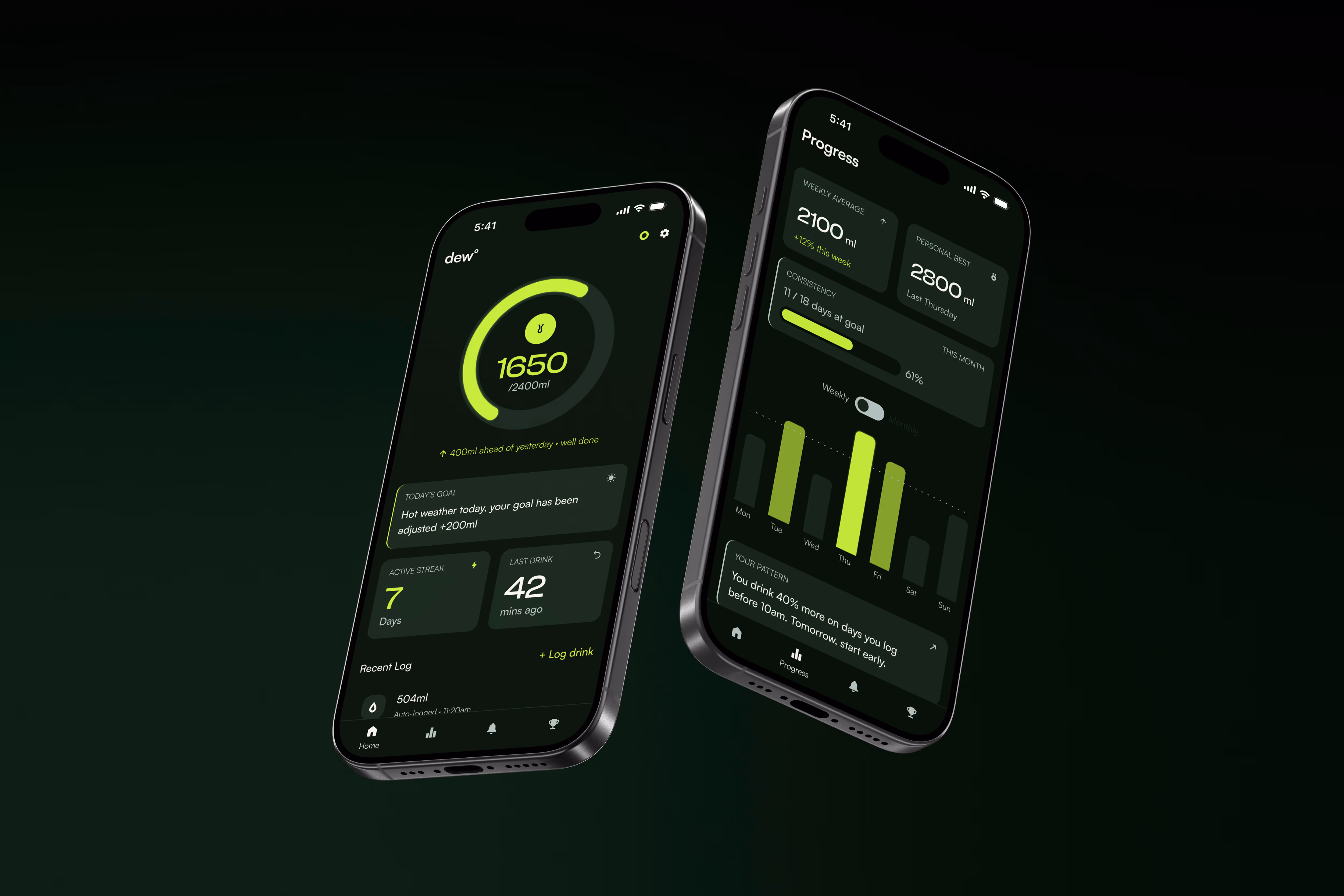
06 | The app
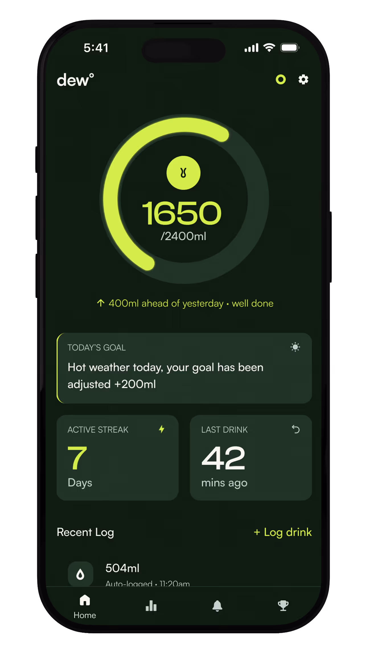
home
The ring closes once a day and resets the next morning, making hydration feel like a daily loop than a hard-set target. The insight cards gives more context that makes the goal feel tailored to them, through weather adjustments, performance patterns and momentum.
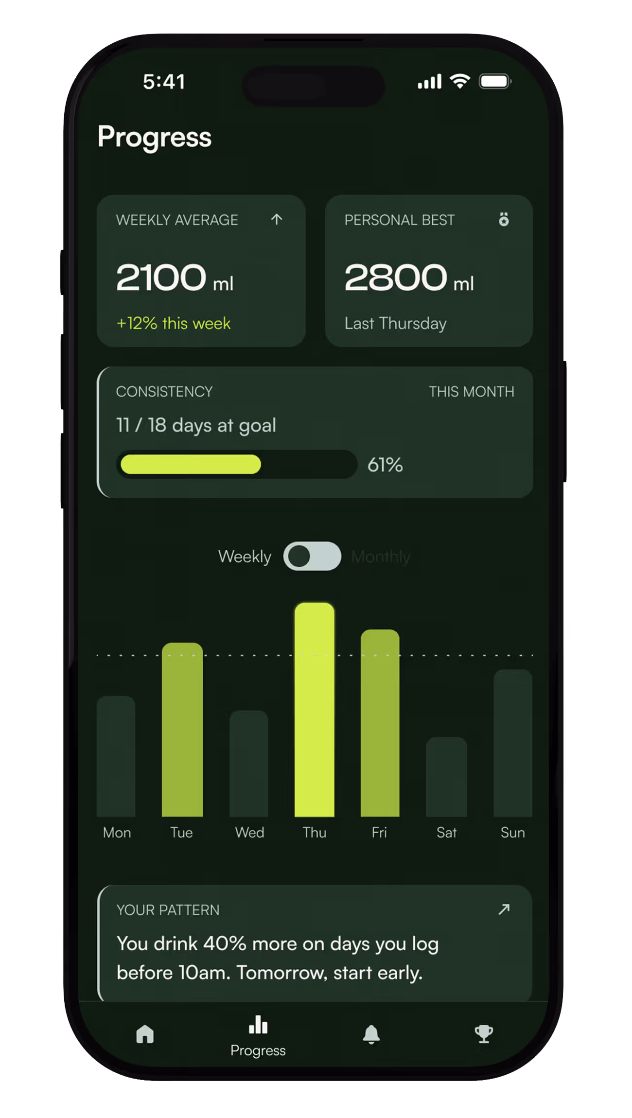
Progress
Data is only useful when it's specific enough to act on. For example "You drink 40% more on days you start before 10am" can be more useful than an "ml average" count. The insight cards interpret the data into useable information, so you don't have to.
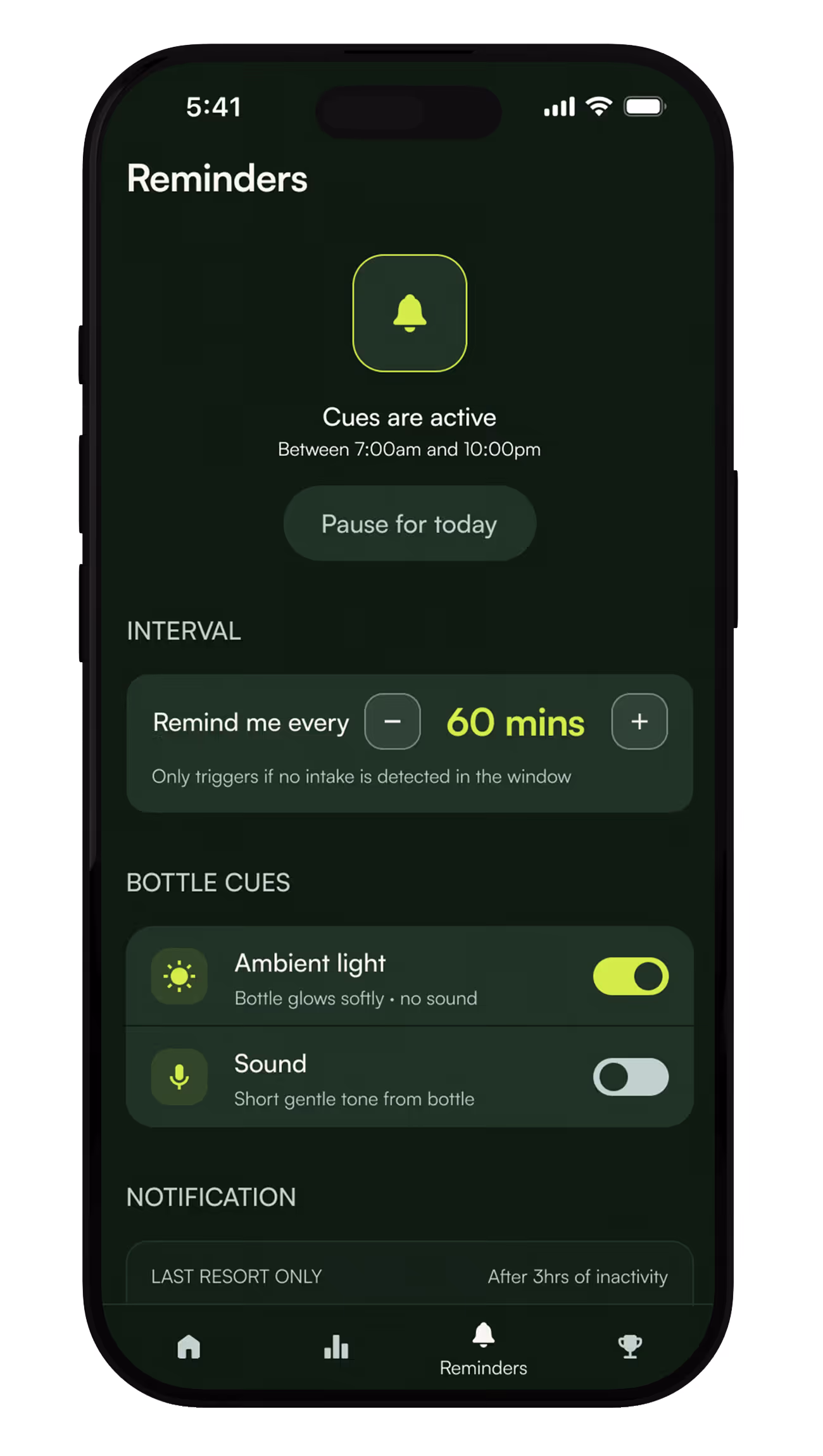
Reminders
In the prompt hierarchy, the bottle cues are placed above the phone notifications. This is to communicate that the bottle is primary and the phone is a last resort. It only triggers if no intake is detected within a certain window.
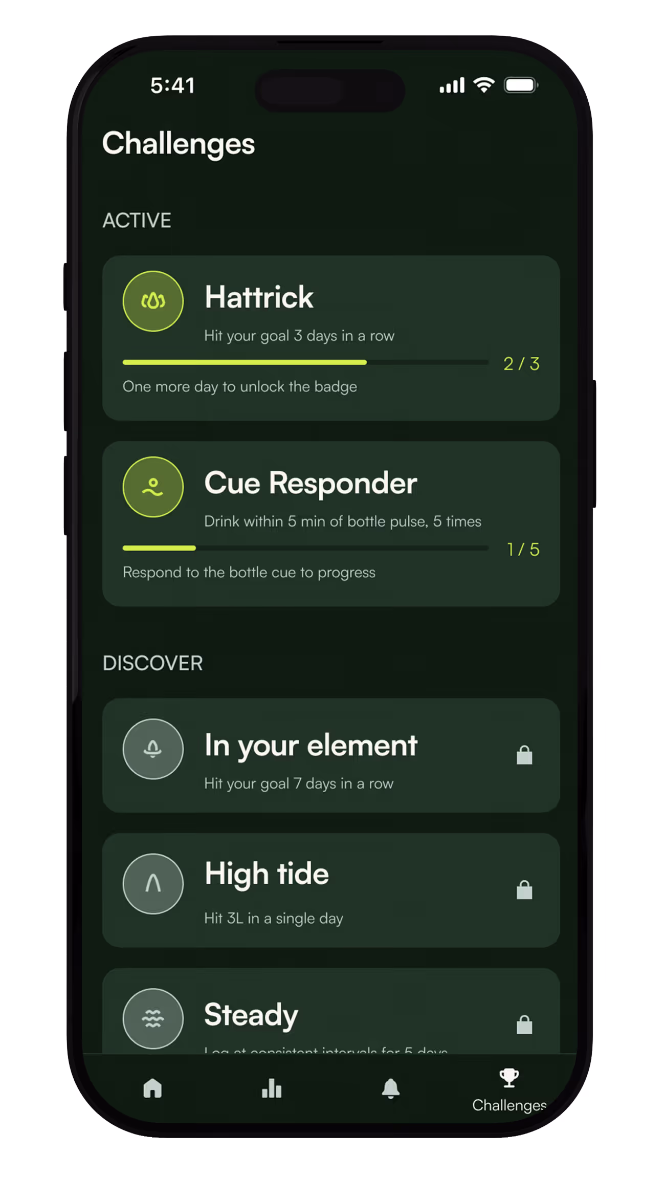
Challenges
The first badge reveal is a high-point for Lisa, a snapshot of her 3-day run: average intake, goal days hit, a trend line. She has the option to share it with her friends or keep it to herself.
07 | Beyond the App
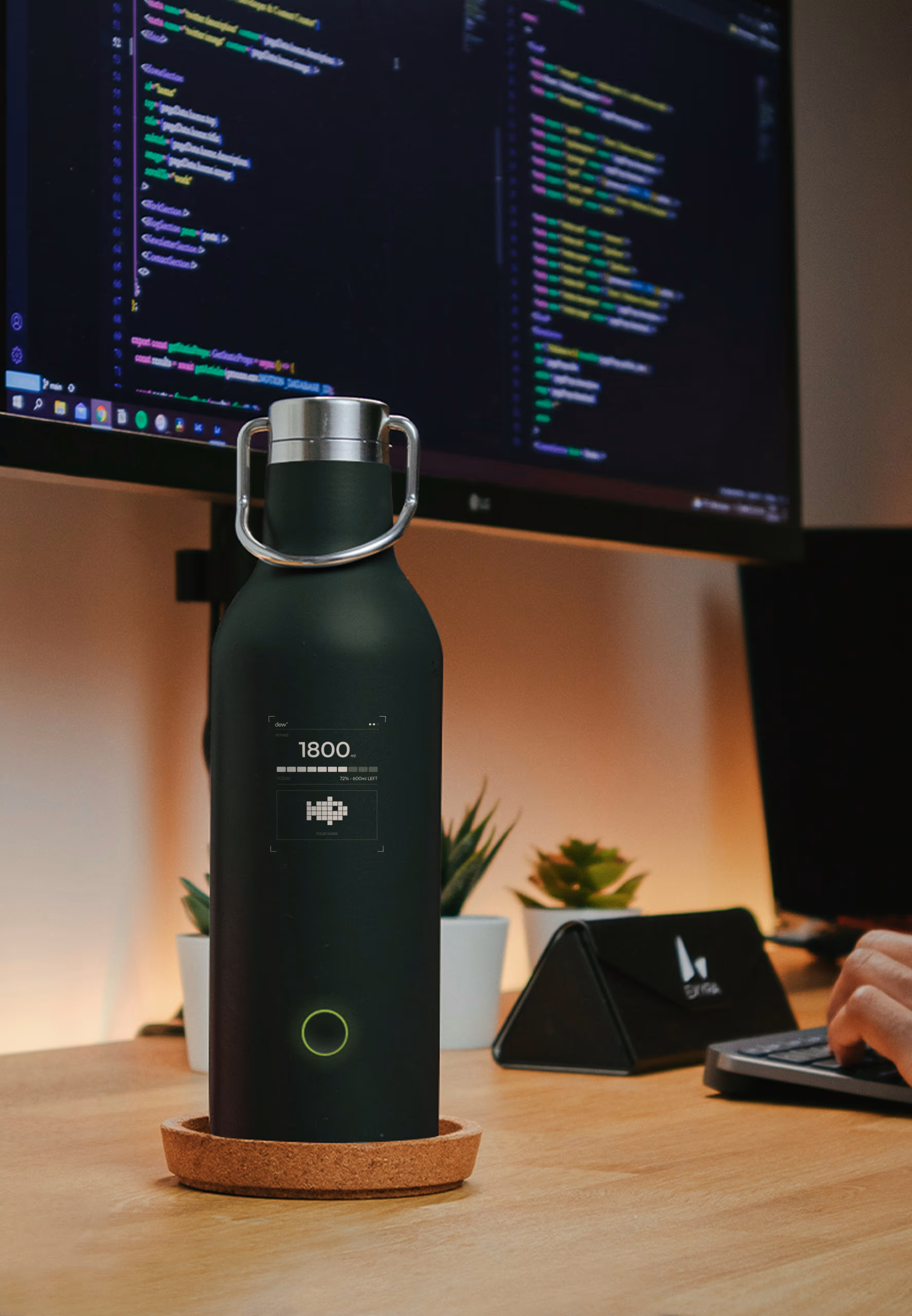
The e-ink display was designed to be readable in under a second, giving you what you need without having to open your phone. The progress view shows the custom doodle, current intake and a progress bar. The doodle makes the bottle feel like yours, making it a daily companion.
When testing layouts, the horizontal version was rejected early. Palm contact during use distorts the screen and blocks content. The vertical layout won on every metric that matters, glanceability, thumb reach, and physical comfort during a natural grip.
08 | VISION
This version was built with health-tech applications in mind. Over time, dew knows your hydration patterns across months, correlated with your self-reported energy, your environment, and your activity. This system could surface insights with genuine clinical relevance:
- Flagging consistent under-hydration during periods of high cognitive load.
- Generating exportable hydration reports for use in primary care contexts.
- Building adaptive goals based on their most recent physiological data.
09 | Reflection
The curved surface made me re-think the embedded display entirely. Holding a physical bottle and thinking through the interaction, palm placement blocked content in a way I didn't anticipate. I scrapped the horizontal layout, moved the screen towards eye level, and cut half the content. The number, progress bar and doodle were the elements that remained. This process could have been faster if I'd tested on a physical bottle in the earlier stages.
Throughout the project, the scope would widen to include another demographic or use case, but I found that the product was the strongest when I only included its most robust features. The ambient-first notifications, passive tracking, and the challenge system survived because they were backed by research. I'd still want to test out the doodle board with real users, to find out if the identity attachment argument is convincing.
